RIJONTTAK
Designing a HODL app in one month, in the middle of the Ripple crash, for holding on together with the people on your floor
- Product
- RIJONTTAK Android App
- Role
- End-to-end Page Planning · Interaction Design
- Period
- 01/2018 – 02/2018
- 2 months
- Problem
- Ripple, the most liquid coin on the market, swung so violently that more and more participants were taking losses
- Alerts that fire on every price move fuel the urge to sell instead of helping people hold
- People who bought in at the same price had nowhere to check on each other and hold on together
- Impact
- Designed, within a month, a scenario that alerts only when the price rises, from registering purchase and target prices to reaching the goal
- Derived three visual rules from an elevator UX motif (floors, coins, atmosphere) and applied them consistently across every screen
- Delivered the motion assets and interpolation values needed for Android development through a ProtoPie prototype and an interaction guide
Problem
In January 2018, the 10th cohort of NEXTERS, an inter-university IT developer club, kicked off a one-month project to build a new service. The theme was Ripple (XRP), and the name was RIJONTTAK, short for "Ripple is made for HODLing." I was in charge of planning every page and building the interactions.
When the project began, XRP, which had stayed below $0.50 throughout 2017, had passed $2.50 in early January 2018. By late January, when we held our first meeting, it had already fallen back to around $1. Ripple, the most liquid coin on the market, had the most extreme swings up and down, and accordingly, more and more market participants were experiencing losses.
I framed the situation as three problems.
Price drop alerts get in the way of holding. Exchange apps send notifications when the price goes up and when it goes down. The only thing a person can do after a drop alert is cut their losses, and that selling creates the next drop.
You can't find people in the same position. Communities mix people from every price point. Someone who bought at KRW 3,800 and someone who bought at KRW 1,200 read the same news in completely different ways. There was no way to know how many people had entered at the same price as me, or what they were thinking right now.
Holding on has no goal. "HODL" describes a state where neither how long nor how far you will hold has been decided. With no end in sight, you get off partway.
Approach
Scenario Design
The first decision was to lock notifications to a single direction. I built a scenario that notifies only when the currency value of XRP rises, measured against the value it would hold if cryptocurrency one day functioned as a real currency.
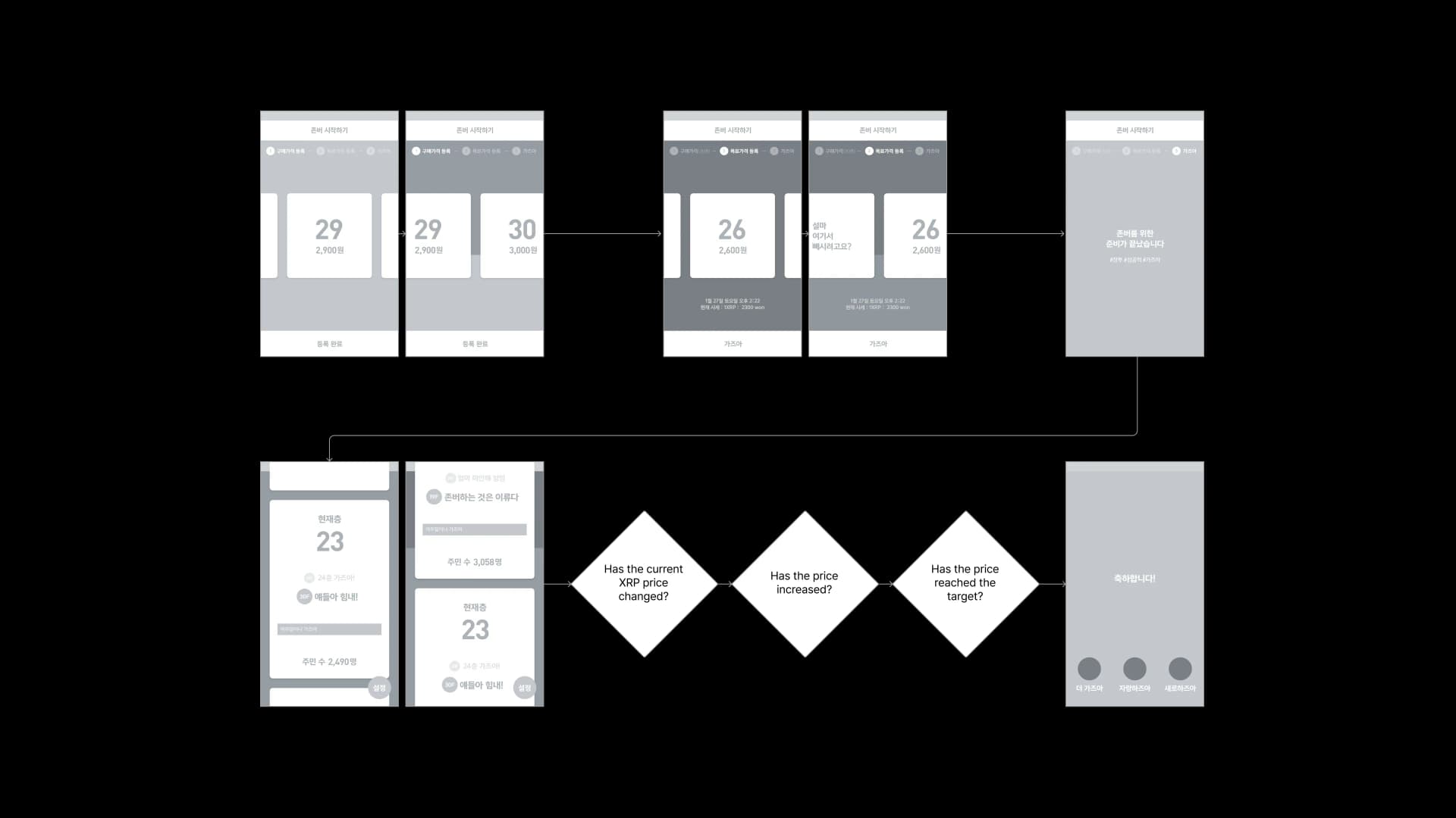
On this premise, I split the user journey into three stages.
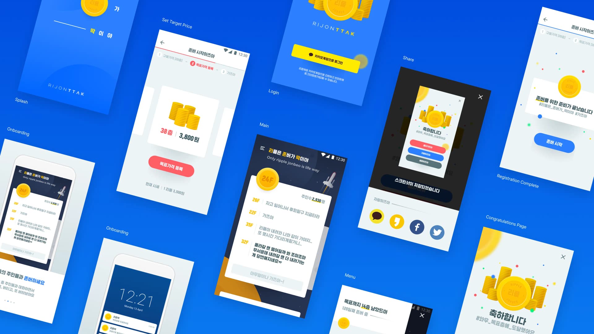
- Register the purchase price. You register the price you bought at as a floor. KRW 100 is Floor 1, so if you bought at KRW 2,600, you are on Floor 26.
- Register the target price. You pick the floor you want to reach. As you swipe left and right to choose a floor, the background graphic behind it moves up and down with you. The selection is limited to at least 3 floors above the current XRP price, because a target below the current price isn't HODLing.
- Main. Once registration is complete, you enter your floor with the message "You're all set to HODL."
UX Motif: The Elevator
When Koreans talk about their average purchase price, they naturally ask, "Which floor did you buy on?" That phrase is what brought the elevator to mind. It struck me as an upward-facing space where people on the same floor can talk to each other.
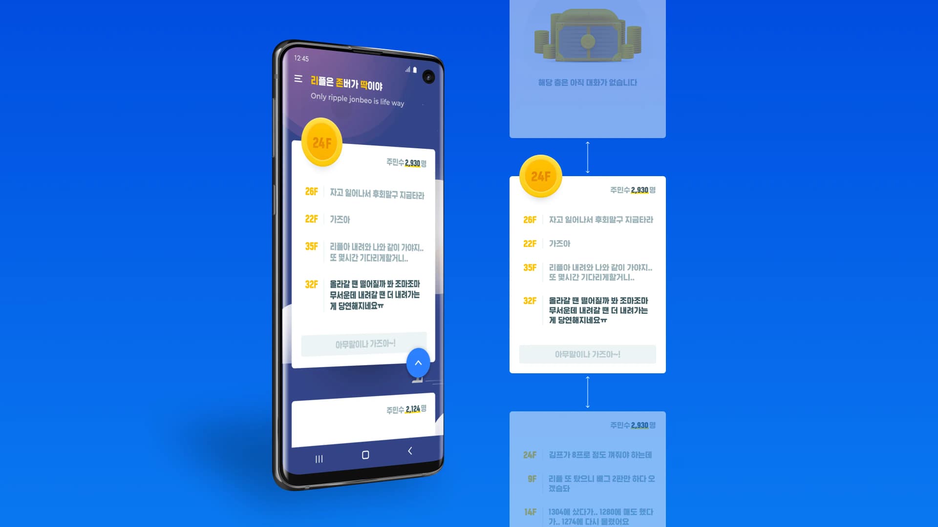
On the main screen, one floor is one card.
- The top of the card shows the current floor's coins and the number of residents.
- Inside the card, that floor's conversation piles up. Each message is prefixed with the writer's floor number, so it is clear who is speaking from where.
- Scrolling moves you between floors. Flick up or down and the next floor's card follows, with the background changing along with it.
Design Motif
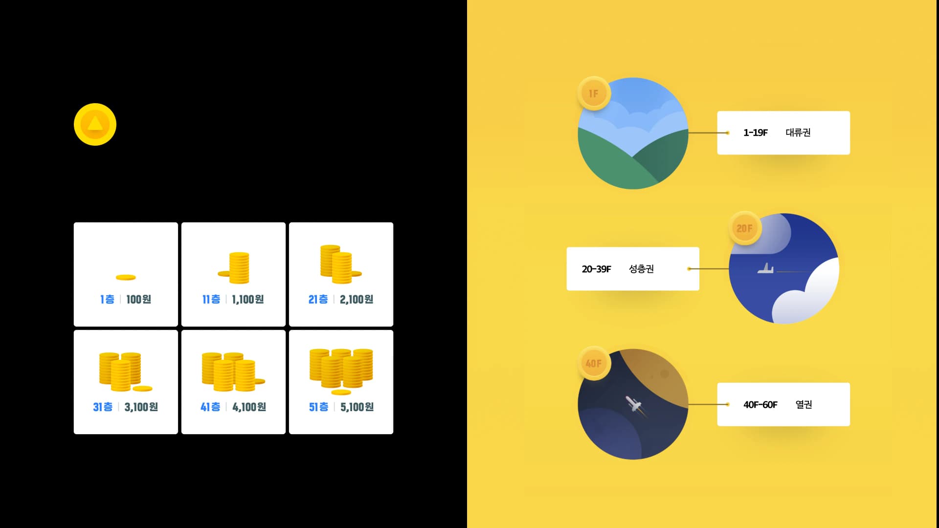
From the single metaphor of an elevator, I drew three visual rules.
- The app icon is the up button. I placed the elevator's ▲ button on top of a yellow coin. There is no ▼ button in this app.
- Floors are expressed as a number of coins. Floor 1 is a single coin, Floor 11 is one stack, and Floor 51 is five stacks. Without reading the amount, you can guess how high a floor is from the pile of coins on its card alone.
- The background is the atmosphere. Altitude changes as you rise. Floors 1 through 19 are the troposphere, with clouds and hills in view; floors 20 through 39 are the stratosphere, where airplanes pass by; and floors 40 through 60 are the thermosphere, with rockets floating overhead. This is why the sky on Floor 24 of the main screen is deep navy.
The three rules reference each other. As coins pile up, the background darkens, and what you can see changes the higher you go. What users should feel when they move floors is not a change in numbers but a change in altitude.
Prototype and Interaction Guide
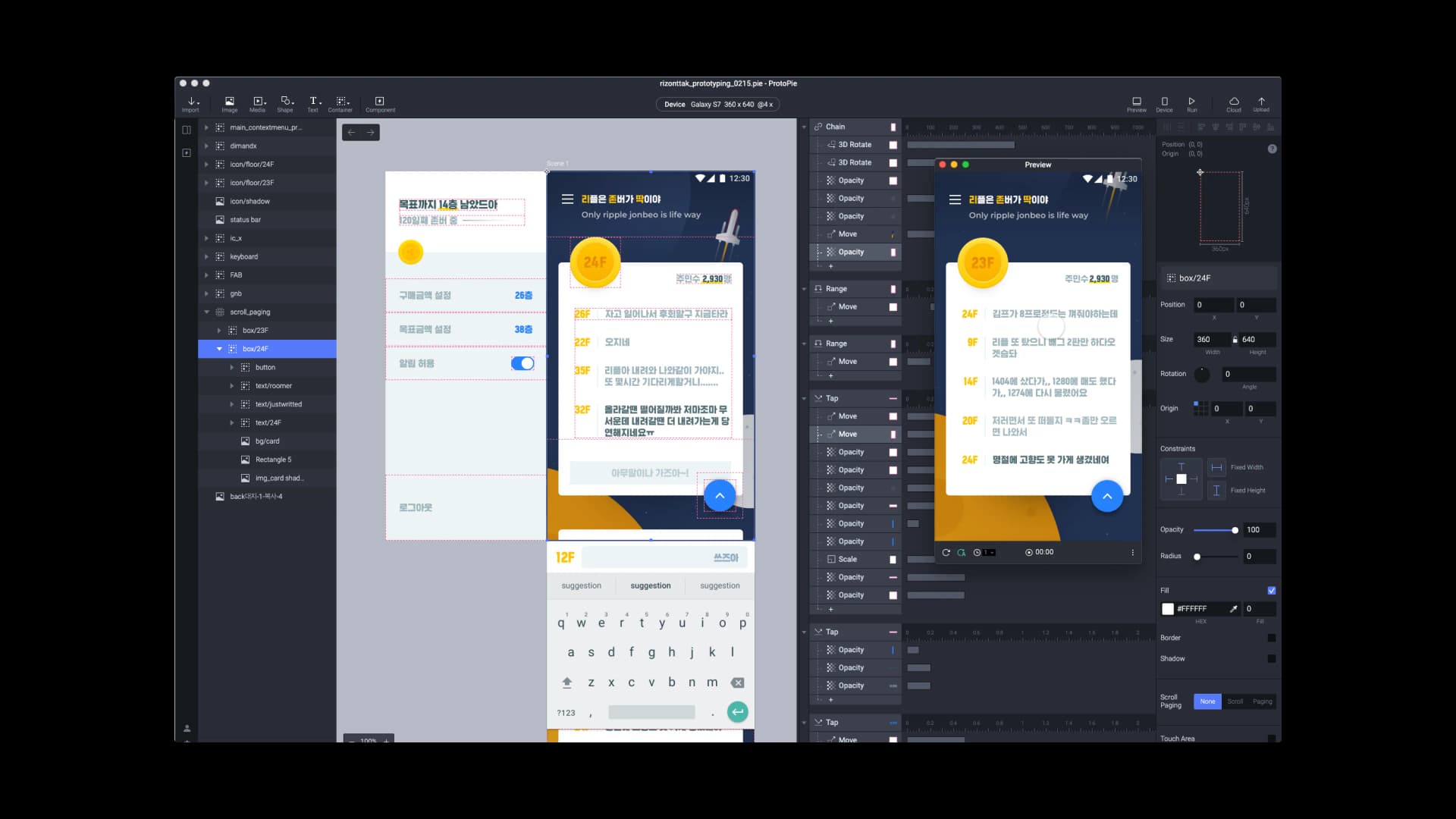
In a one-month project, the best document a designer can give a developer is one that moves. I built a prototype in ProtoPie and implemented interactions with real values: scroll paging of floor cards, the movement and opacity changes of floor coins, and the tap response of the floating button.
To this I attached an interaction guide listing the motion assets and interpolation values needed for Android development. Because which layer moves how many pixels along which curve can be read straight from the prototype, developers never have to eyeball it and guess again.
The menu drawer shows time spent holding alongside the distance remaining, with copy like "14 floors to go!" and "HODLing for 120 days." Purchase and target amounts can be reset here, and the notification toggle lives here as well.
Outcome
I planned every screen of the service within a month: splash, onboarding, Kakao account login, purchase and target price registration, registration complete, main, menu, share, and the celebration page. Sharing saves the celebration screen as a screenshot and sends it to KakaoTalk, Facebook, or Twitter, so the moment someone reaches their goal brings in the next user.
Notifications arrive only when the price rises. The promise this project, born in a bear market, made to users was "we'll stay quiet when it falls," and every branch of the scenario was designed to keep that one promise.
From the single metaphor of an elevator, I created three visual rules, the app icon, coins per floor, and the atmosphere background, and applied them consistently across every screen. On any screen, users read which floor they are on and how much further they have to climb from the picture before the number.
The ProtoPie prototype and interaction guide went straight to the Android developers, cutting down the back-and-forth over motion values.
What I learned from this project is that removing features is the same work as designing an emotion. Dropping the price-drop alert, never drawing a down button, and allowing a goal to be chosen only above the current price were all decisions to take something away. The sum of those removals became the service's attitude: "Let's hold on together."