LDF Mobile Redesign
A two-year redesign that started with a single product detail page and grew to cover the entire display section
- Product
- Lotte Duty Free App
- Role
- Mobile UI Design · Interaction Guide
- Period
- 04/2019 – 12/2020
- 1 year 10 months
- Problem
- Customer demand for multimedia content rose even as COVID-19 sent sales plunging
- Screens were more complex than competitors', with lower color and design appeal
- Product detail page bounce rate on the Korean mobile site was gradually rising
- Display sections stayed a bare purchase path and failed to convey the appeal of product content
- Impact
- Average dwell time on product detail pages rose from about 5 to 6 minutes, and bounce rate fell 6%
- Organized 83 key product detail page components into a design system, setting the standard for common components
- Deployed a code-based interaction guide to minimize development communication issues
- Proposed a sale tab structure that expanded purchase conditions beyond price to time, quantity, and popularity
Problem
In 2020, Lotte Duty Free's sales plummeted because of COVID-19. Operating profit turned into a loss, and the company was in no position to sell products to customers in the immediate term. So the company focused on next year's customers rather than tomorrow's. It needed an image beyond that of a duty-free store that only shouted about deals.
Quantitative Analysis
We commissioned a partner firm to run an online survey of about 500 men and women aged 20 to 49 living in Korea and China. The issues boiled down to three:
- The layout is complicated — product detail main
- There is too much unnecessary information — detailed information section
- The colors are unappealing — recommended products unit
Customer Analysis
In July, we ran an affinity diagram study with the luxury-brand-preference segment (about 600,000 customers). The goal was to verify whether there was enough customer demand for product content.
When browsing products
- Finding a product appealing through promotional or outfit content featuring celebrities, influencers, and models was the most common case
- Many were drawn in by product reviews, but focused on quality over quantity
- In some cases, preference depended on whether stacked or quantity discounts were shown
When receiving benefits
- 59% felt the urge to buy in discount scenarios, with exclusive personal discounts and high discount rates having the strongest influence
- Demand for anniversary events and birthday coupons was especially high
- Sudden guerrilla promotions increased the urge to impulse-buy
Persona and Journey Map
From these findings, I built a persona of a beauty shopper who wants "the best quality at the lowest price": 32 years old, a cosmetics packaging designer, living in Jamsil, Seoul. She wants to shop on her next trip, has run out of some cosmetics, and wants to switch her lipstick. For her, I identified the following needs:
- Strong awareness of reward points
- A new standard for recommended products
- Reviews and Q&A sorted by buyers with a skin type similar to mine
- The price after reward points (the real purchase price) shown per product, even before ordering
Proposal
Main Page
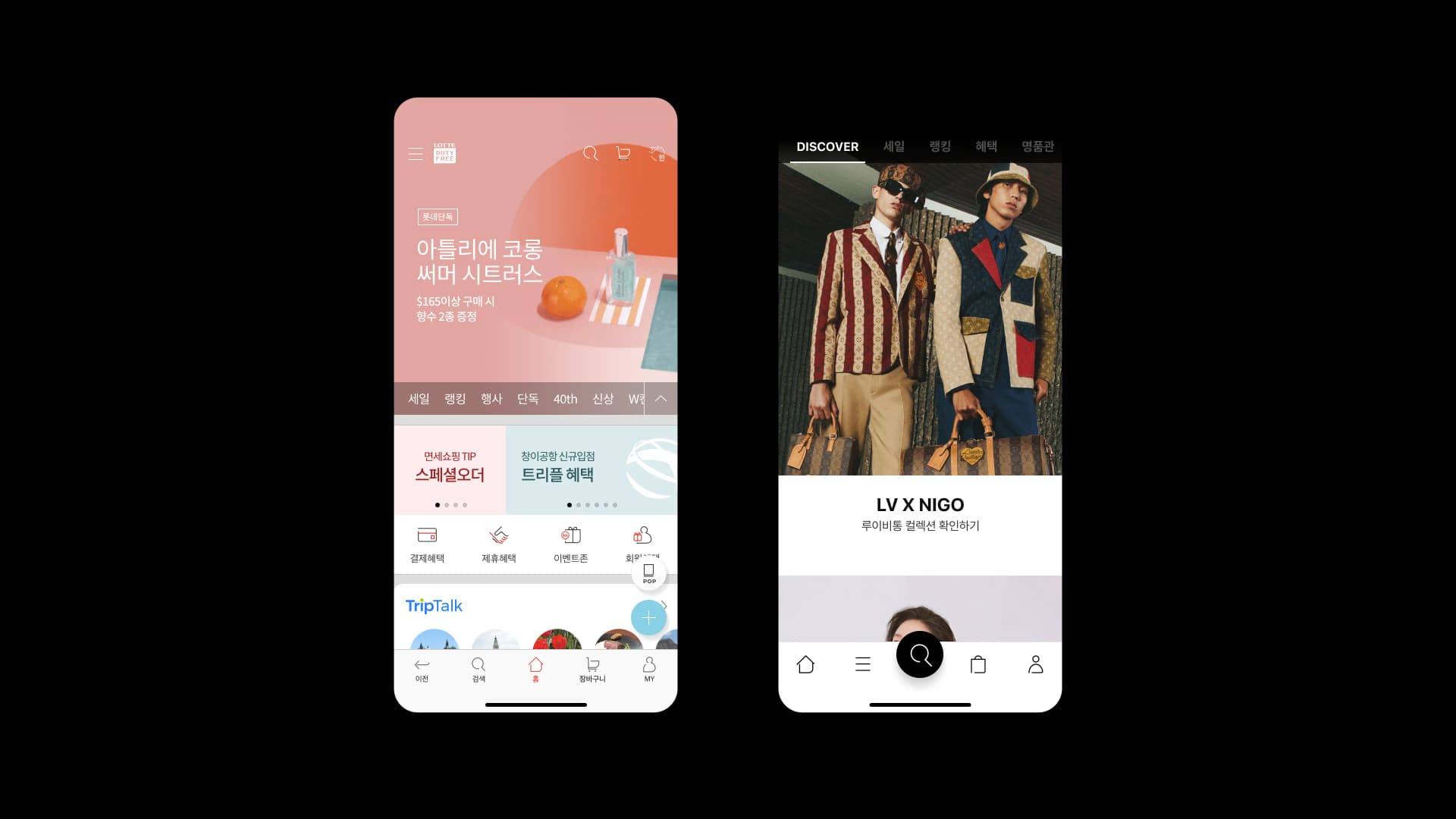
The AS-IS main page had a promotional banner occupying the top, with rows of feature icons and tabs lined up beneath it. In the TO-BE design, the DISCOVER tab takes the first position and most of the screen is given over to content imagery. Sale, Ranking, Benefits, and Luxury step aside next to it. What the customer meets on the first screen is a "scene," not a "discount rate."
Magazine Detail
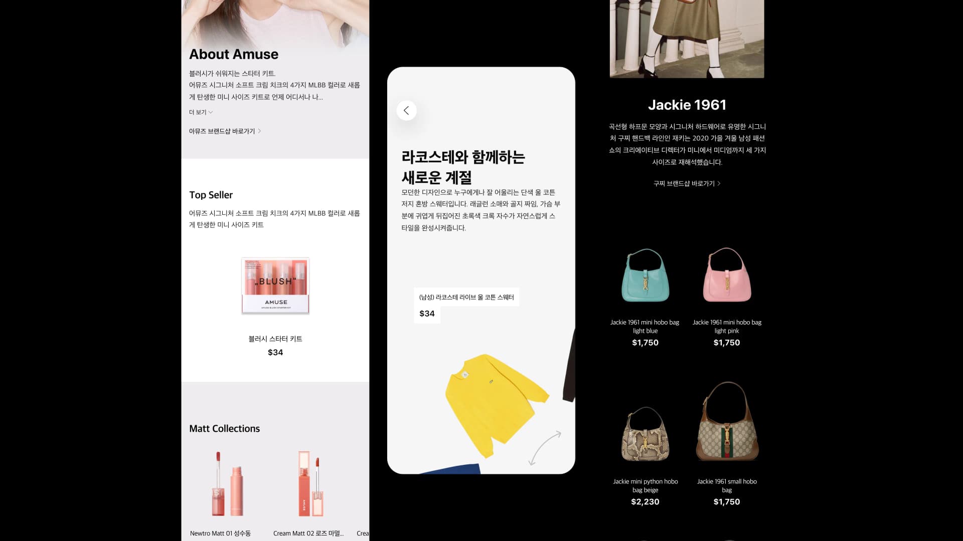
I pitched the storytelling of brands sold in the duty-free store through a variety of magazine-style templates. Every brand speaks in a different voice, so rather than forcing a single detail layout, I made several templates to choose from.
Sale Tab
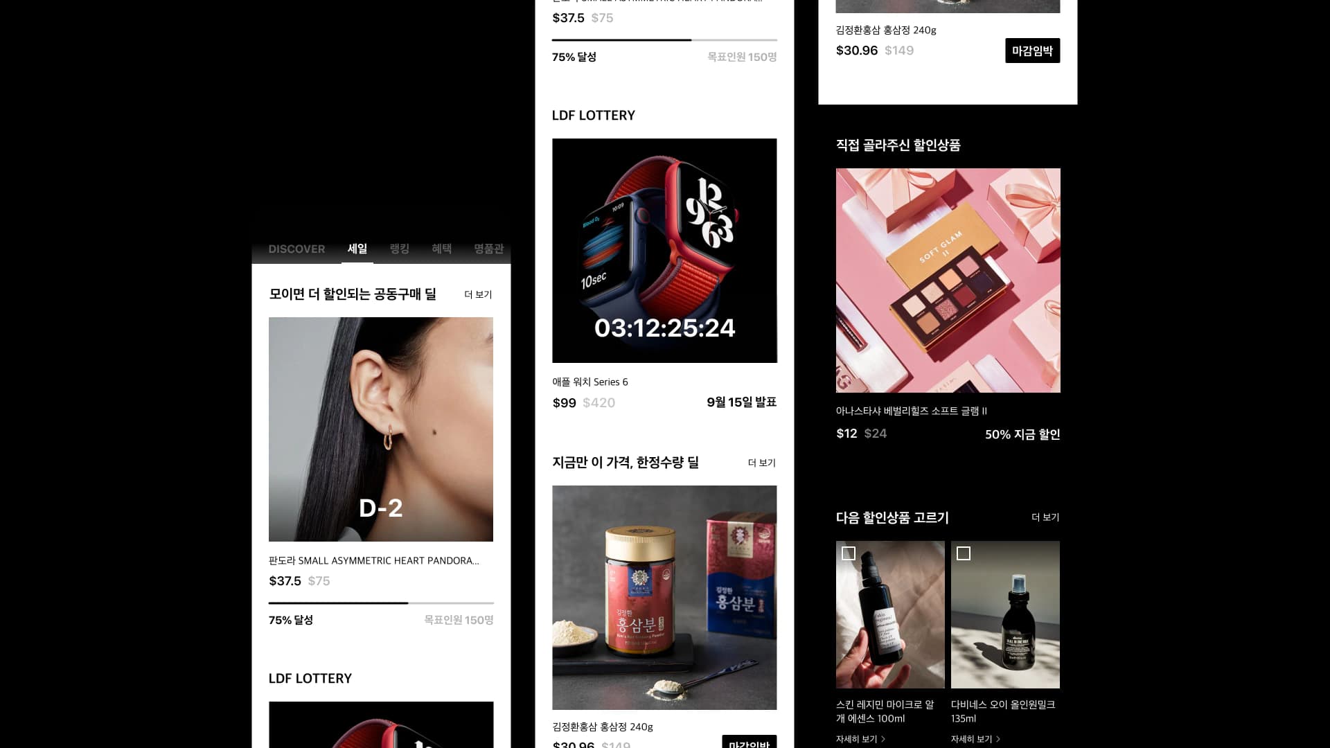
I proposed a new purchase experience that breaks away from plain buying. I designed the following new product display concepts:
- Group Buy Deal: bigger discounts as more people join, showing the target headcount and progress
- LDF LOTTERY: a countdown to the announcement date
- Limited Quantity Deal: shows when a deal is about to close
- Discount Vote: customers pick which product goes on sale next
Product Detail
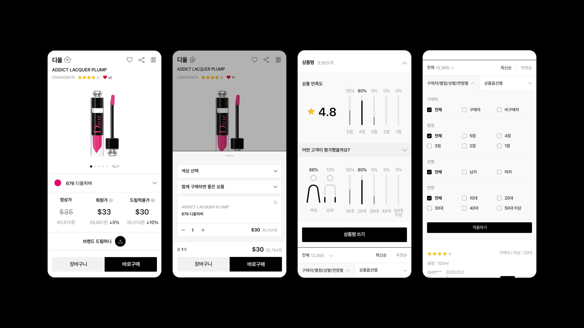
To make product colors stand out, I boldly stripped out red, the Lotte brand color. The decision-maker judged that a good share of the "the screen is complicated" responses came from the brand red competing with product colors.
- Proposed a backdrop component for option selection
- Proposed a product review infographic to match the black-and-white tone and manner
- Expanded review filtering by gender, age, and product option
Outcome
- Average dwell time on the product detail page rose from about 5 minutes → 6 minutes, and bounce rate fell 6%
- Restructured the display to encourage additional purchases from new visitors
- Expanded the exposure of reward-point prices and product content
Confirming the problem with data, asking customers directly, defining the opportunity before drawing by hand, and finally handing it off in code: it was a chance to experience, over a long arc, exactly what it takes to bring a new product to life.