Operating KDS
Running a bank's design system from the ground up
- Product
- Kbank Design System
- Role
- Design System Operations
- Period
- 01/2024 – Present
- 2 years 9 months
- Problem
- No reusable components
- No foundation
- No component-level design infrastructure
- Impact
- Established a component migration methodology and identified 30+ components to migrate
- Built stakeholder consensus through color foundation design
- Created per-product component usage metrics to quantify contribution to reusability
Problem
When I joined Kbank in 2021, KDS (Kbank Design System) was hardly in a state that could be called a system. The design components built in Framer were not connected to the development components at all, and nothing documented which people in which departments were actually using them. In short, everything was ambiguous. At the time, I narrowed the problem down to three issues.
No reusable components. Framer offers no way to centrally control when components are released. On top of that, three years ago most Kbank products pulled these components in and detached them, so the UI was drawn slightly differently in every product.
No foundation. Base values such as color, typography, and shadows were set without rules, so no matter how thoroughly the components were organized, fragmentation kept coming back. This article focuses on color, which had the strongest demand for reuse.
No component-level design infrastructure. Even a component that design had defined as "ready to use" had to be built in a different shape by every development team.
Approach
Framework Migration
In 2025, Kbank kicked off a large-scale front-end migration from its existing framework, IB20, to React. IB20 is a commercial web framework developed by Initech in Korea and used mainly by domestic financial institutions. At that point, the implementation vendor needed design criteria for common components that could be used on every screen. Kbank happened to be adopting Figma at the same time, so I converted the entire set of Framer components for Figma while applying the following criteria:
- Prioritized SASS class reuse. I identified which classes used which styles, and how often each style was used, to structure the components and their names.
- Based on Figma, we limited the scope of style modifications at the component level. We reduced code fragmentation by restricting the props that can be overridden.
This process yielded an unexpected bonus. Past design agreements that had never been documented survived as comments on the related classes in the legacy code. As I combed through the classes, I pulled those rules back out and organized them. Since internal materials are confidential, I will explain with a hypothetical example.
Example: Building the RectangleButton Component
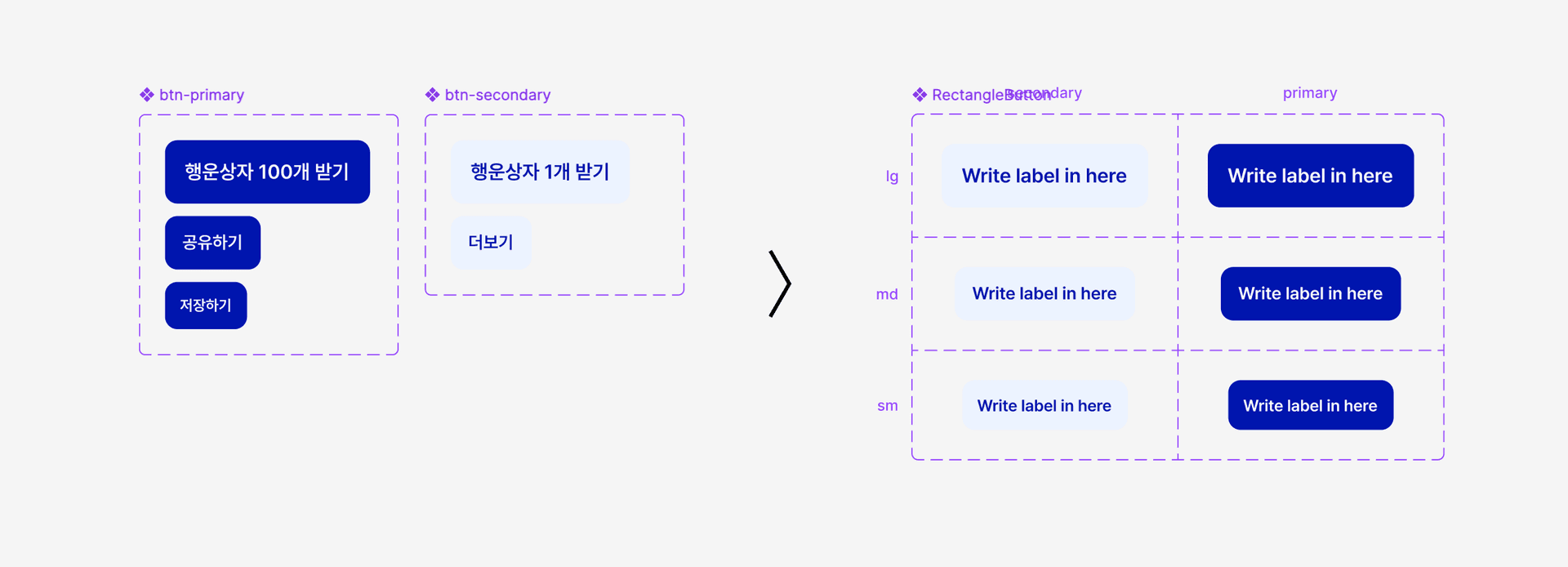
Let's assume the button below is mainly used fixed to the bottom of a page. Extracting the code in Eclipse would show something like this:
<!-- Bottom-of-screen CTAs use a font-size of 16px -->
<div class="btn btn-primary font-size-16">
	Get 100 Lucky Boxes
</div>
Based on this, a matching component called btn-primary is created in Figma. Once several patterns like this are identified and built as components, the implementation vendor abstracts them into a new, generalized button concept called RectangleButton.
By applying this method repeatedly to the style code of every screen targeted for migration, a component set built on the React framework can be assembled as shown below. The code is an example of the shape of the deliverable the implementation vendor would produce.
type Tone = 'primary' | 'secondary';
type Size = 'lg' | 'md' | 'sm';

// tones and sizes are style maps that reference color and spacing tokens, respectively.
const RectangleButton = styled.button<{
  $tone?: Tone;          // Locked to tokens
  $size?: Size;          // Locked to tokens
  $background?: string;  // The only point where an override is allowed
}>`
  ${({ $size = 'lg' }) => sizes[$size]}
  ${({ $tone = 'primary' }) => tones[$tone]}
  ${({ $background }) => $background && css`background: ${$background};`}
`;
This hypothetical RectangleButton component is composed of $tone and $size props, while $background gives product designers the option to modify the background color. The accompanying guideline ensures that when a background color does need to change, the product designer can do so after consulting the shared-component owner, within limits that do not introduce accessibility issues.
Designing the Color Foundation
Color is the material that can impose cognitive load on users in the shortest amount of time. Everyone wants to use brighter colors with stronger contrast, but to compose colors that fit their purpose, I created the following:
- Adopted OKLCH. In OKLCH, the next-generation web standard color space, moving lightness, chroma, and hue in uniform steps produces differences that people also perceive as uniform. I designed a predictable color ramp from a single Kbank brand seed color.
- Created semantic tokens. I assigned a role to every color and guided designers away from colors without an assigned role. I fixed a hierarchy at the color level and split each level's usage into background, text, icon, and border, establishing rules that comply with accessibility contrast guidelines without compromising the aesthetics of the system.
Rolling out this policy brought conflict with many designers. The most common question was why I was restricting values that had been working fine. The basis for persuasion was not restricting values but establishing flexible rules. To draw in as many designers as possible, I built a prototype for composing the hues of the color ramps used for colors, effects, and more.
In this prototype, you can take the colors decided by the Brand team, along with the already established semantic colors for warning, error, and success, extract the hue, lightness, and chroma of each, and define new colors. In practice, I implemented a table of usable colors at 11 hues by 12 lightness levels. Using this table, I composed semantic colors with light and dark modes assigned.
Creating KDS Usage Metrics
Even after introducing the components and foundation above, simply picking a component that fits the product's purpose from Figma's asset list does not unlock the full potential of KDS. Quantitative metrics on KDS usage are essential to extending the lifespan of components.
- I indexed the finalized frames that everyone had agreed to use for product development, and tracked the ratio of common components referenced within them.
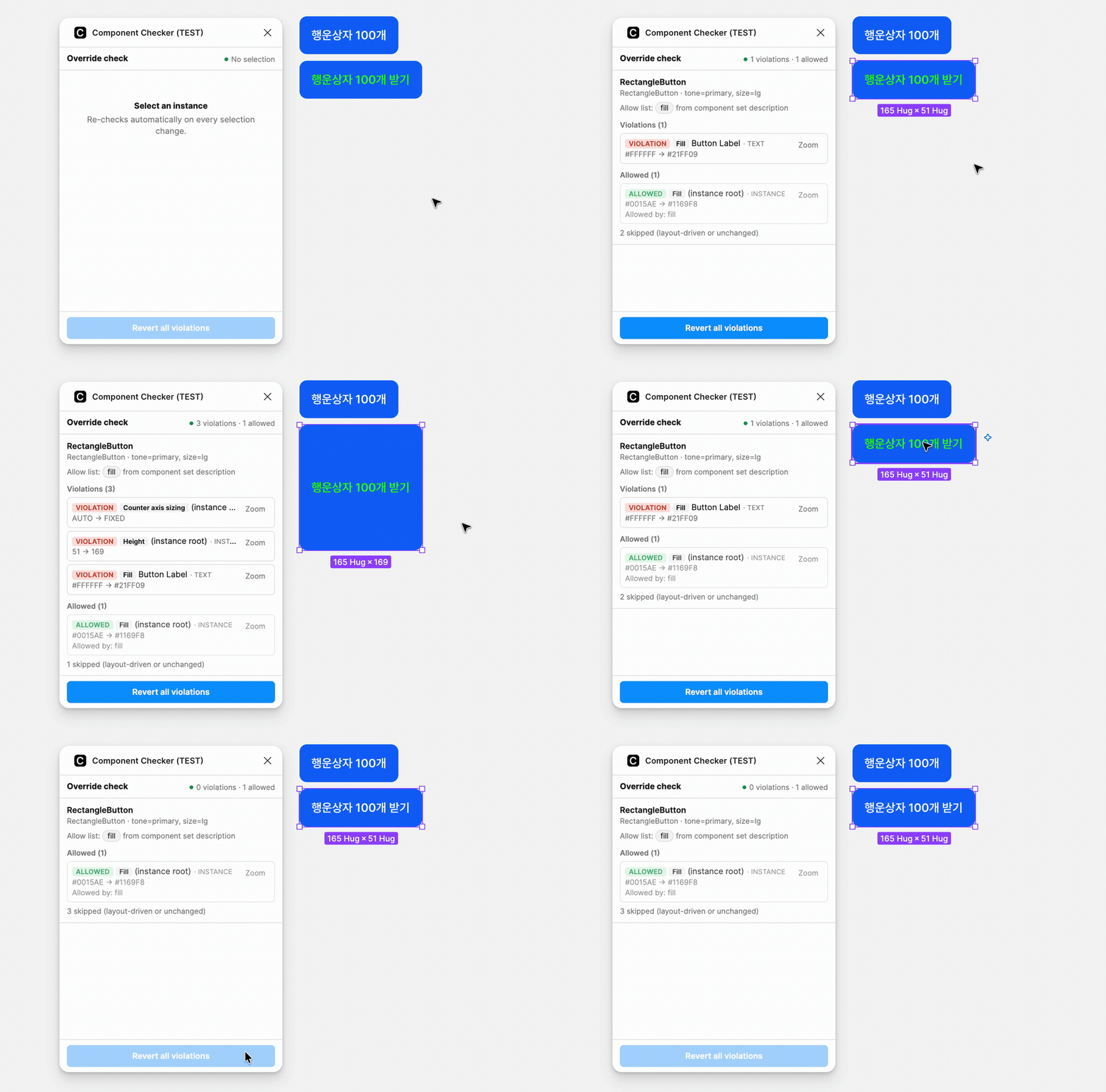
- I verified the allowed range of instance overrides with a Figma plugin. Which of the properties overridden in the design are props that development can actually support gets confirmed before it is handed to service developers. The problem of design and development looking at different lists is caught before the conversation even starts.
The frames shared between developers and designers were pinned at the team, folder, file, page, and frame level. This agreement became the foundation for updating the latest metrics of every file in the workspace in real time through the Figma REST API.
To identify issues in each instance, I use Component Checker. Back to the RectangleButton: product designers are alerted in real time if they modify any property that is not meant to be changed, other than the background color. Since NodeChangeProperty tracks 117 types in real time, setting the editable properties and their allowed range lets you configure a detailed policy for every single component.
Outcome
I ranked reuse priority by how often SASS classes were used, mapped them to Figma components in that order, and established a process for the implementation vendor to abstract them. Applying this methodology across every screen targeted for migration, I identified more than 30 components that could be converted into a component set.
Through OKLCH-based color ramps and semantic tokens, I involved product designers in the entire color selection process rather than simply restricting values.
Using the Figma REST API and a Figma plugin, the gap between design and development was filtered out before it ever reached person-to-person communication.
Operating a product always comes with hard decisions. A design system in particular is constantly caught at the crossroads of how to distribute limited resources, and to whom. At every one of those moments, I ask what I should do to remind users of the purpose behind every Kbank product: the slogan of "a feel-good financial life."